West Coast Centre for Sex Therapy
Launching a shiny new brand and web experience for the future of sex therapy. An inclusive, non-judgemental and trusting experience for all so that clients can feel welcomed to be their authentic selves and live more fulfilling lives.
Brand & Identity Design
Custom Wordpress Web Design
Visit the Site →

Dr. Jason Winters and Dr. Carolin Klein reached out looking to create a brand and website for their new sex therapy practice in Vancouver, BC.
Their vision was to create a space where clients felt safe, heard and welcome to be their true authentic selves no matter their gender identity, sexual orientation, race, preference, or story.
I worked with Dr. Winters and Dr. Klein to determine their target audience and get an understanding of the sex therapy practices that exist. The existing landscape appeared stale, boring and neutral. No one was pushing boundaries, or making a point to remove the stigma around talking openly about sex and the sexual experience. It was clear there was a need for a practice just like they had envisioned.
With help from Gemini Branding, they decided on a descriptive name— West Coast Centre for Sex Therapy. It held true to their vision of being direct and open, rather than abstract and tip-toeing around the subject manner.
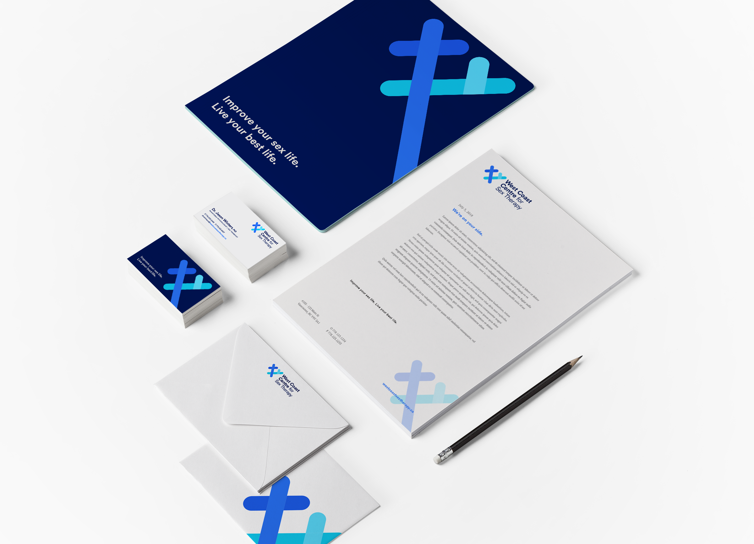
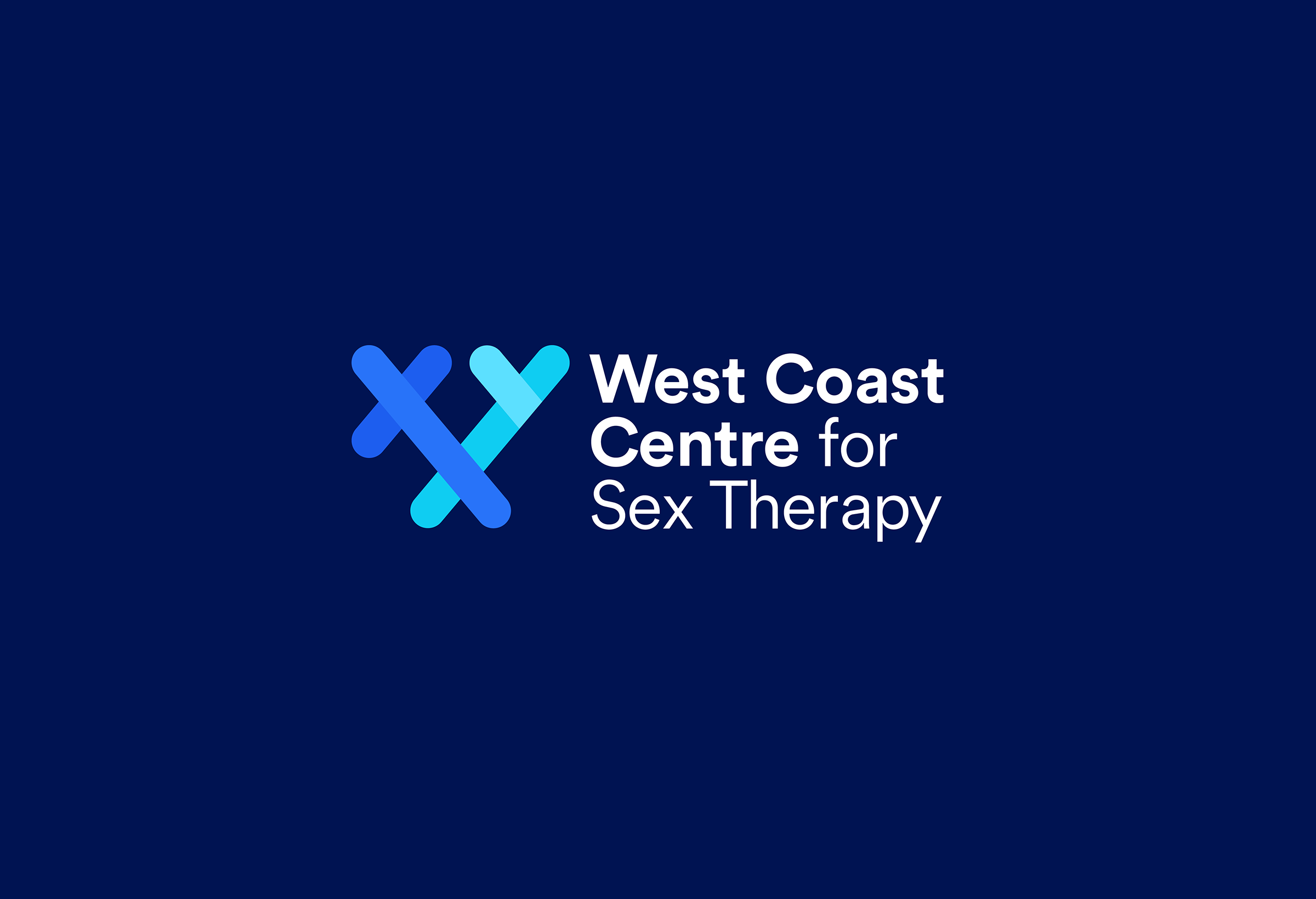
The logomark is an X and Y intersecting, based off of the x and y chromosomes — representing each and every one of us, and the relationships we have with others. It’s an inclusive mark, using a bright blue colour that doesn’t sway more masculine or feminine.
The wordmark that it is paired with uses a circular, geometric sans serif, giving a modern, approachable but professional feeling. The logomark is used at a large scale throughout digital and printed touch-points to frame content and provide a consistent visual interest.

Upon landing on the homepage, you see representation of all kinds of people and pairings. There is a general understanding that WCCST welcomes all.
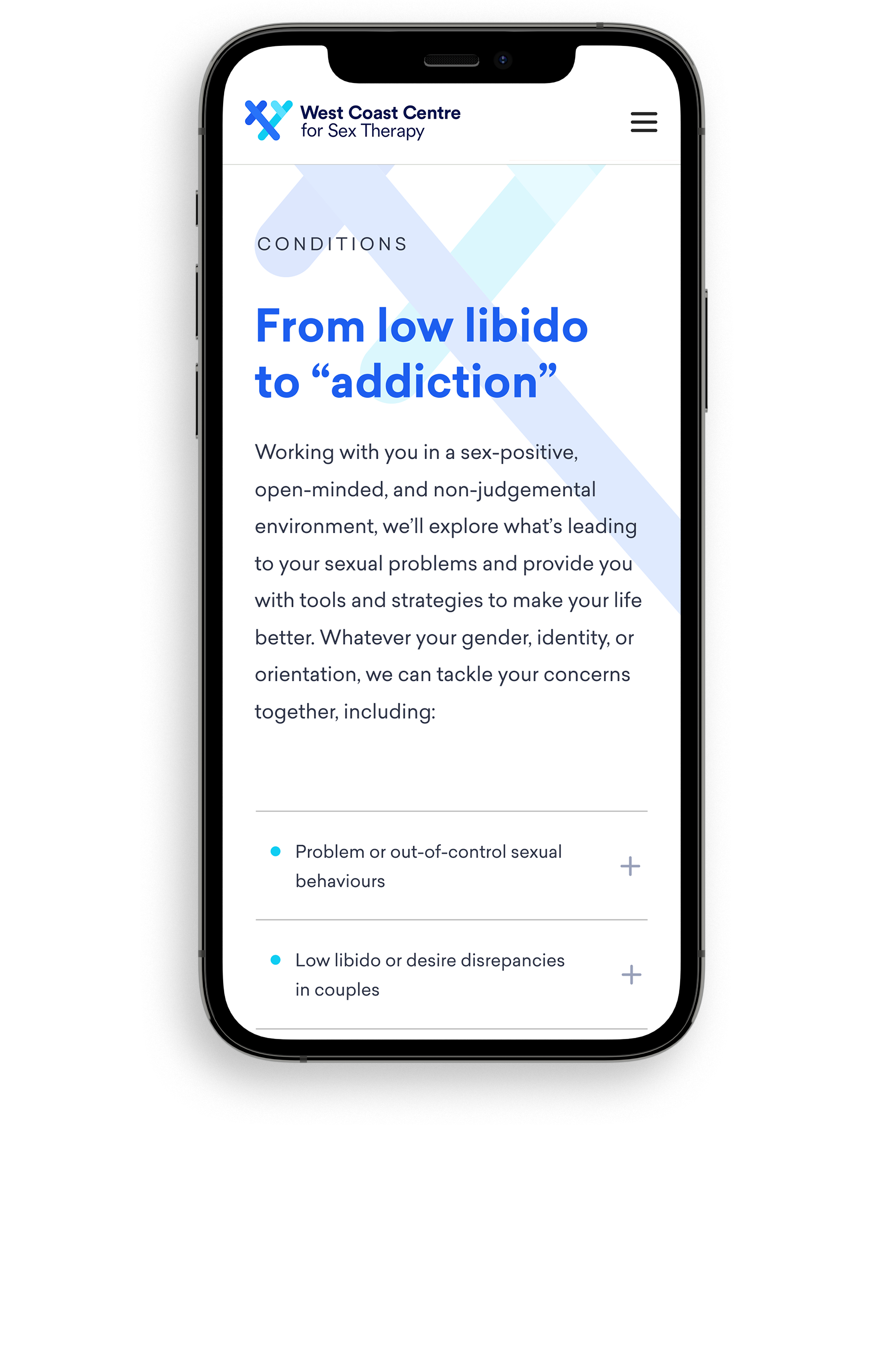
While navigating throughout the web experience, there is an overall visual brightness that matches the copy. Supporting images are selected to highlight relationships and put the focus on people, connection and their well-being. Things aren’t overly sexualized, but we consciously decided to not avoid the feeling of intimacy.
It was important to include ample information so that potential clients could feel as comfortable as possible when booking their first consultation, the use of iconography, strong typography and well defined hierarchy makes the extensive amount of information easy to digest.